The Funniest and Most Brilliant 404 Page Designs on the Web
Most 404 pages are just digital dead ends, but they don’t have to be. A clever 404 page design can surprise, entertain, and even keep users engaged when things go wrong. Whether it’s a funny message, a nostalgic mini-game, or some eye-catching visuals, the best ones turn errors into brand moments. We’ve rounded up some […]
Most 404 pages are just digital dead ends, but they don’t have to be. A clever 404 page design can surprise, entertain, and even keep users engaged when things go wrong. Whether it’s a funny message, a nostalgic mini-game, or some eye-catching visuals, the best ones turn errors into brand moments. We’ve rounded up some of the smartest, funniest, and most creative 404 page designs that prove getting lost isn’t always a bad thing.
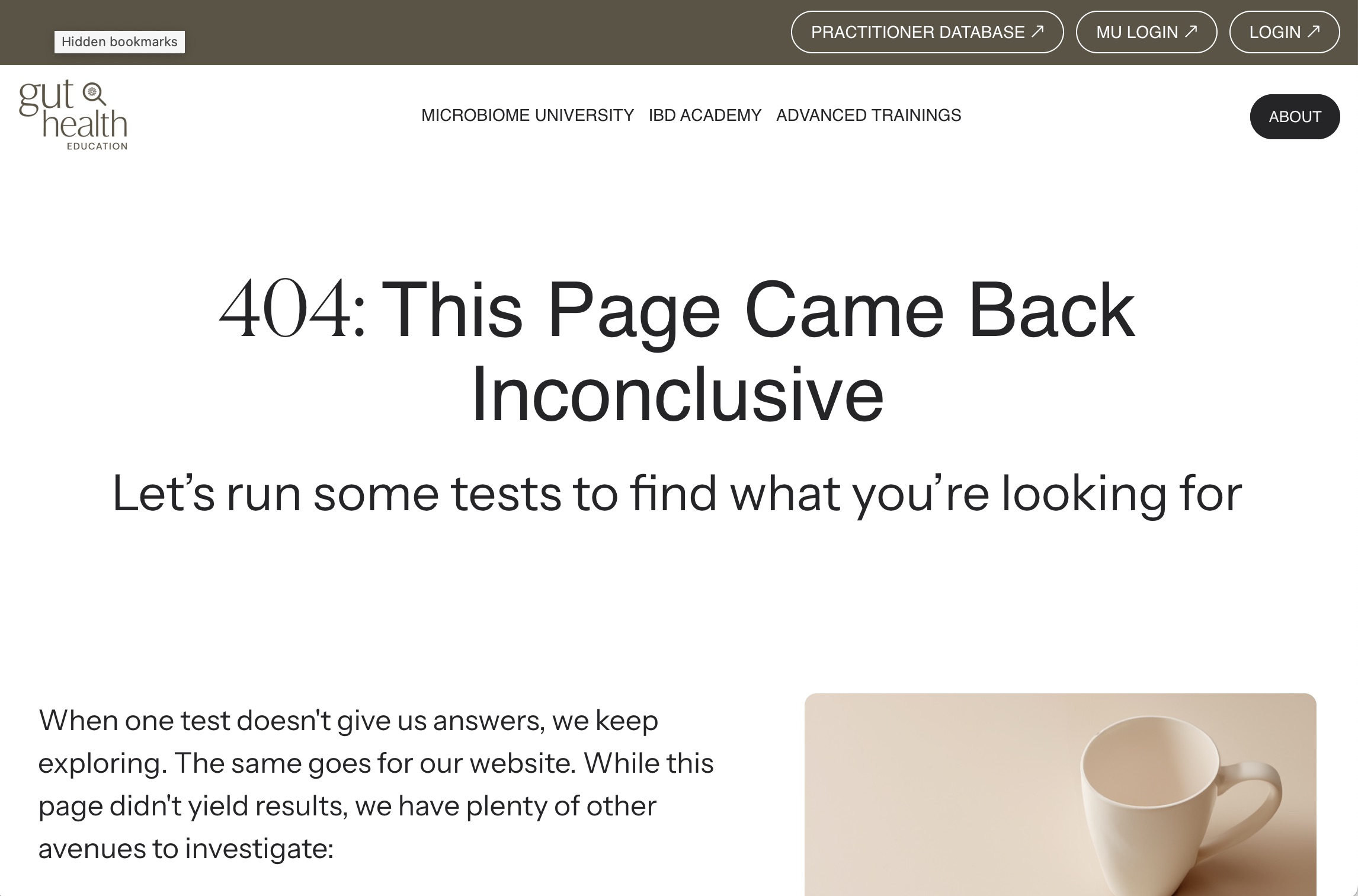
1. Gut Health Education – “404: This Page Came Back Inconclusive”
This one’s a textbook example (pun intended) of how to tailor a 404 page design to your niche. Gut Health Education leans into their medical and scientific tone with the headline: “404: This Page Came Back Inconclusive.” It’s a smart play on diagnostic language, instantly aligning with their audience of health professionals and wellness seekers. Instead of a generic “not found” message, they reassure users: “Let’s run some tests to find what you’re looking for.”
Why it works: It’s relevant, reassuring, and completely on-brand. Instead of forcing a joke or playing it safe, they stick to their tone and audience, making the error feel like part of a thoughtful process—not a glitch.
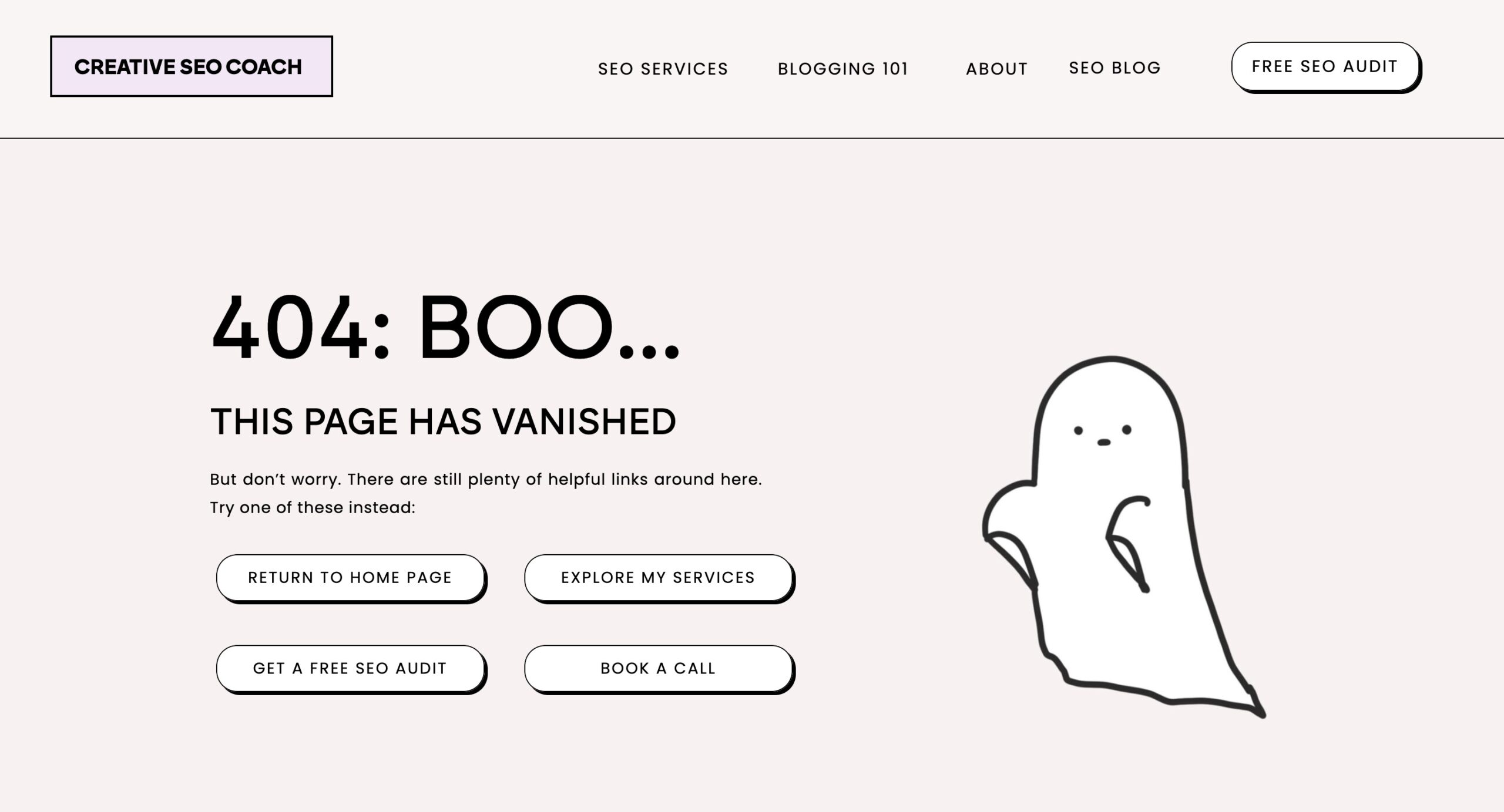
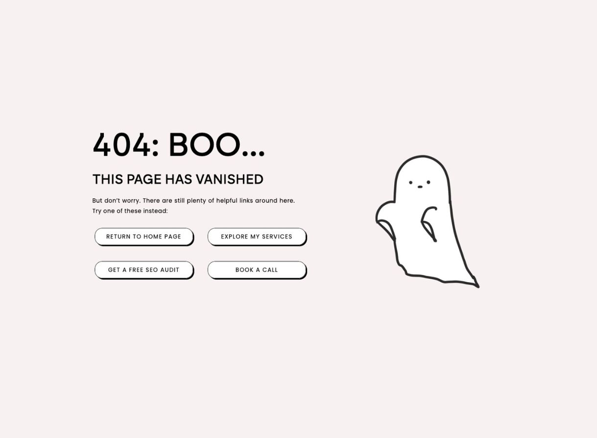
2. Creative SEO Coach – “404: Boo… This Page Has Vanished”
Sometimes you click a link expecting gold and get poof—nothing. Creative SEO Coach turns that moment of frustration into something lighthearted and on-brand. With a soft blush background, a lovable ghost illustration, and just the right touch of spooky sass.
The message is simple: “This page has vanished.” But instead of leaving you haunted, it offers four friendly escape routes—Home, Services, Free SEO Audit, and Book a Call—all laid out as bold buttons that feel more like invitations than redirects. It’s helpful, cute, and unmistakably human.
Why it works? It’s approachable, aligned with the brand’s personality, and offers real utility without trying too hard. A perfect example of how a little design charm and good UX can make even an error page feel like part of the journey.
3. Kit – “Oops! Page Not Found (But Here’s a Dog)”
There’s a classic advertising truth: “When in doubt, put a dog in it.” Kit leans into that wisdom with heartwarming simplicity. Their 404 page doesn’t try to be clever—it just gives you an apology, a helpful link back to the homepage, and most importantly, a picture of a very good dog.
Dubbed a “KitPet,” this fuzzy couch companion instantly takes the edge off the error. No complex wordplay, no forced metaphors—just pure, serotonin-boosting canine content. It’s the digital equivalent of a friend handing you a cookie after bad news.
Why it works: Universally charming and low-effort delight. It softens the blow of a broken link and builds brand warmth instantly—no clever copy required.
4. Emma Troy Design – “India the Horse Ate That Page”
Whoops. Looks like India the horse ate that page!
When life gives you a 404, Emma Troy gives you a horse with a side of personality. This error page is delightfully whimsical, pairing a funny, personalized message with a charming photo of India mid-snack. Add a few quirky suggestions (share popcorn, meet Duke the Weimaraner, explore adventures), and it turns a broken link into a branded micro-moment of joy. It feels like you stumbled into a lifestyle blog—not an error.
Why it works: Totally on-brand, endearing, and full of personality. You remember India. You remember Emma. You stay on the site.
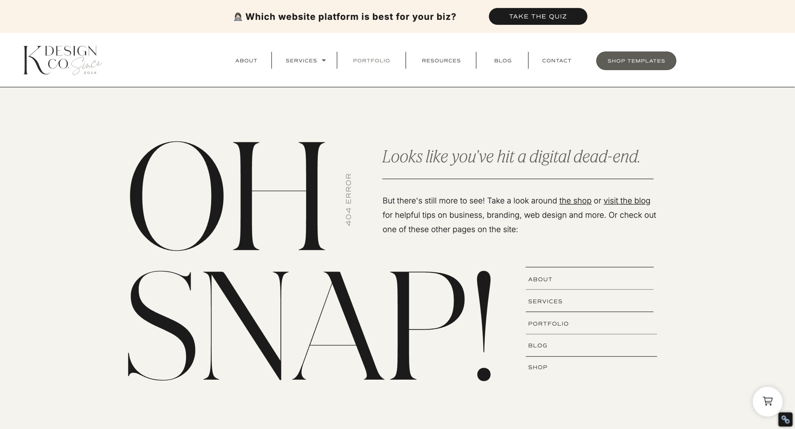
5. K Design Co. – “OH SNAP!”
Loud, proud, and typographically dramatic, this one doesn’t whisper its error—it shouts it. “OH SNAP!” is front and center in bold, stylish serif type, owning the oops with flair. K Design Co. leans into minimal elegance with a digital-dead-end pun and clear next steps: blog, shop, or browse the menu. It’s editorial, it’s sharp, and it keeps you curious.
Why it works: It turns a mistake into a branded statement. Looks good. Feels confident. Keeps the UX clean.
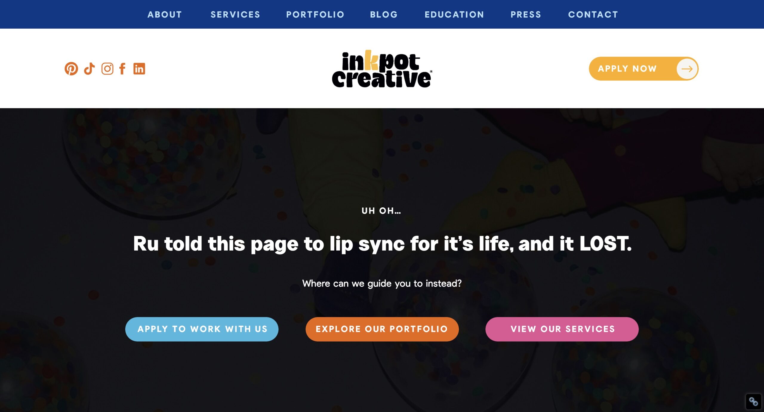
6. Inkpot Creative – “Ru Told This Page to Lip Sync… and it LOST”
Sassy, niche, and fabulous—Inkpot Creative leans all the way into their Drag Race-loving identity. This 404 page references RuPaul in full flair and then immediately offers three strong CTAs: apply, explore, or view services. It feels like a party, not a problem.
Why it works: It speaks directly to their audience with confidence and humor. If you’re their kind of client, you’ll feel seen (and sold) immediately.
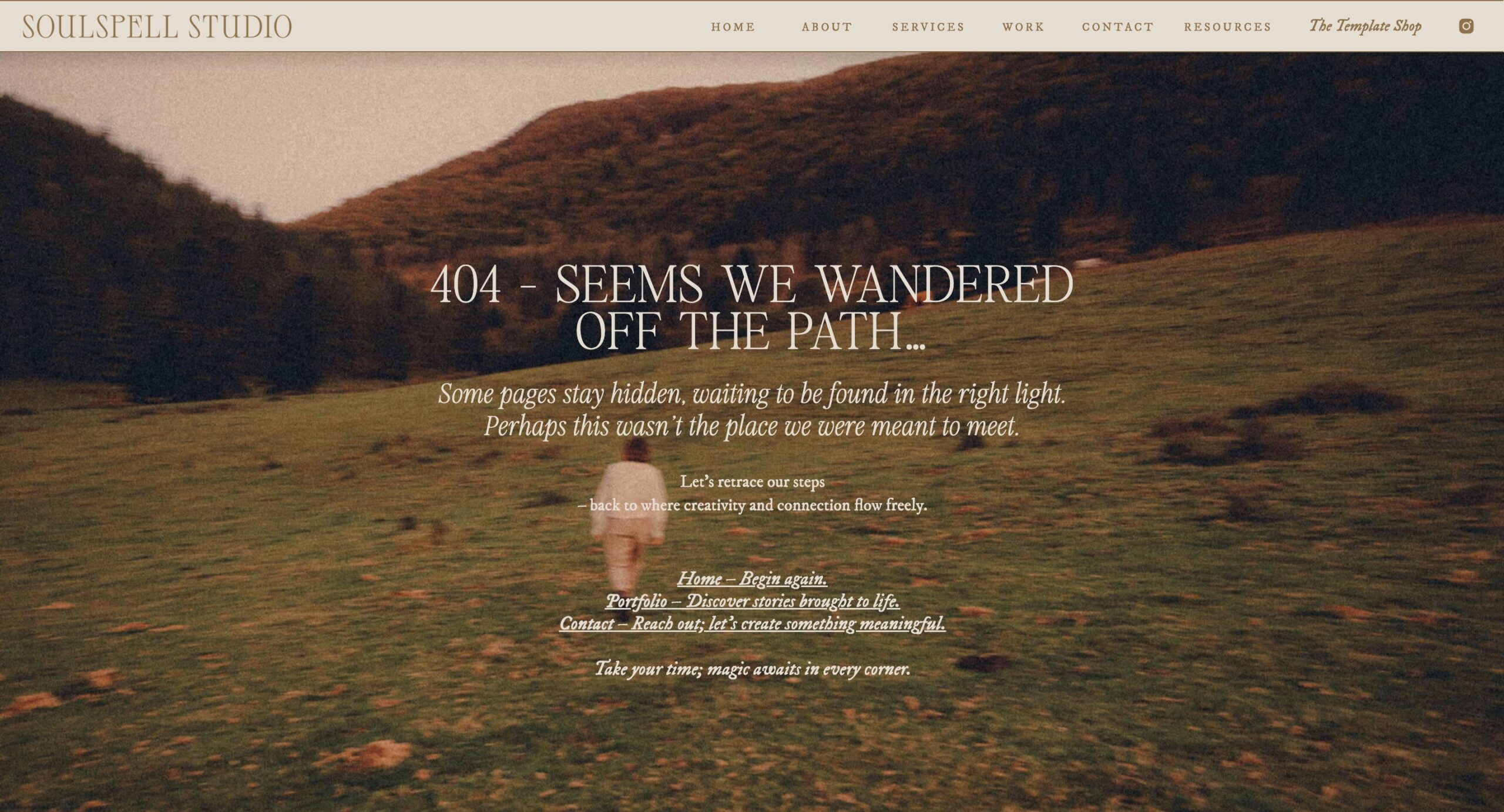
7. Soulspell Studio – “404: Seems We Wandered Off the Path…”
Some 404 pages make you chuckle. This one makes you feel. Soulspell Studio leans fully into its dreamy, introspective brand tone with a cinematic forest backdrop, wistful copy, and a gentle nudge to “retrace our steps.” Instead of a sterile error, it reads like a page from a fairytale: “Perhaps this wasn’t the place we were meant to meet.”
With links labeled like invitations—Home: Begin again, Portfolio: Discover stories, Contact: Let’s create something meaningful—this 404 doesn’t just redirect you. It reenchants you.
Why it works: It transforms a broken link into a brand-aligned experience that feels intentional, atmospheric, and deeply creative. Even a mistake feels magical here.
8. Japanblend – “Oops! This Page Wandered Off Like a Lost Tourist in Tokyo”
This 404 is simple, clean, and irresistibly charming. Japanblend uses bold typography and a playful cultural nod: “maybe it caught the last train or got distracted by sushi.” It’s a lighthearted way to frame a page error while reinforcing the brand’s Japan-centric vibe. Emoji add an extra wink without overdoing it.
With two clear buttons—Back to Home Page and Email Us—this page quickly shifts the user from “uh oh” to “ok, let’s fix this.”
Why it works: It’s minimal but memorable. The copy is clever, brand-specific, and instantly puts a smile on your face—exactly what a good 404 should do.
9. Archer Inspired – “You’ve Got to Be Kidding Me.”
This 404 page doesn’t try to soften the blow, it throws you straight into a Ron Swanson-level meltdown. Featuring a perfectly looped GIF of Parks & Rec’s grumpiest government worker tossing a computer in the trash, it pairs humor with pure exasperation. The message: “PAGE NOT FOUND?!?! YOU’VE GOT TO BE KIDDING ME.” A perfect reflection of how we all feel when a link goes rogue.
With a minimal layout and a quick link back to the homepage, it lets the GIF do all the talking—and it’s hilarious.
Why it works: It’s bold, relatable, and doesn’t take itself too seriously. The pop culture reference adds personality, and the humor keeps frustration low (while clicks stay high).
10. Olive Theory Event Co. – “Oh No! This Page Got Cold Feet…”
When your entire brand revolves around weddings, even your 404 page can’t escape the drama of a runaway bride moment. Olive Theory Event Co. leans all the way into the metaphor with the line: “This page got cold feet…” A blurred, cinematic image of a bride mid-sprint sets the tone, while playful animal characters in formalwear flank the design. The vibe? Whimsical, romantic, and very on theme.
The copy is short and sweet: “We have everything you need to help you tie the knot smoothly back on our homepage.” And that hot pink CTA button is impossible to miss.
Why it works: It’s clever, visually rich, and perfectly matched to the brand’s niche. The marriage metaphor is funny without being forced—and who wouldn’t forgive a 404 that looks this fabulous?
11. MVB – “This Wasn’t on the Timeline…”
MVB handles this 404 like any seasoned event pro would—with grace, sparkle, and a touch of humor. Against a backdrop of confetti and disco balls, the message reads: “Oops… this wasn’t on the timeline.” It’s the perfect metaphor for a missing page on an event planner’s site. The follow-up copy reassures you that chaos is their specialty and that everything’s still under control.
The CTA? “Take me back to the party.” Because let’s be honest—when a link breaks, you do want to go somewhere more fun.
Why it works: It’s witty, brand-aligned, and confidently assures visitors that a little mix-up is all part of the plan. Elegant visuals plus clever copy = 404 gold.
12. Harding Ranch – “This Page Got Out!”
404 errors meet cattle rancher charm in this clever message from Harding Ranch. With a warm, golden pasture as the background and a herd of cows on the move, the headline says it all: “Someone must have left a gate open—this page got out!” It’s a pitch-perfect rural metaphor that makes the error feel like part of the experience.
Even better? The page turns the mix-up into a potential sale with a CTA: “Buy Our Beef.” Clear, helpful, and totally on-brand.
Why it works: It’s clever without being cheesy, rooted in the business’s identity, and smoothly redirects users to exactly what they came for. Yeehaw-level user experience.
13. Vault Skin + Wellness – “This Page Must Not Have Worn Its SPF!”
Vault Skin + Wellness delivers a clever, brand-perfect twist on the classic 404 with this skincare-inspired zinger: “Oh no, this page must not have worn its SPF!” The soft, minimalist background (yes, that’s skin texture) sets a luxe, spa-like tone, while the copy keeps things light without straying from their niche.
The supportive follow-up—“Don’t wrinkle your forehead…”—blends humor with skincare advice, which is kind of brilliant. And with quick links to the homepage, services, and about section, you’re never far from finding what you need.
Why it works: It’s niche, memorable, and surprisingly educational. A perfect mix of brand voice, humor, and helpfulness—wrapped in a silky-smooth design.
14. Local Home Design – “This Page Must Have Gone Out of Style”
Simple, stylish, and self-aware—Local Home Design handles its 404 with the same polish you’d expect from a well-curated living room. With the soft message “Well this is awkward… this page must have gone out of style,” it leans into the interior design theme while keeping things light and approachable.
The muted tones, cozy bedroom backdrop, and clean layout reinforce the brand’s aesthetic. And the follow-up copy gently redirects you: “But if you were looking for an interior designer, you’re in the right place!”
Why it works: It’s clever without trying too hard, and the styling mirrors the brand perfectly. The humor is subtle, the UX is clean, and the vibe? Timeless.
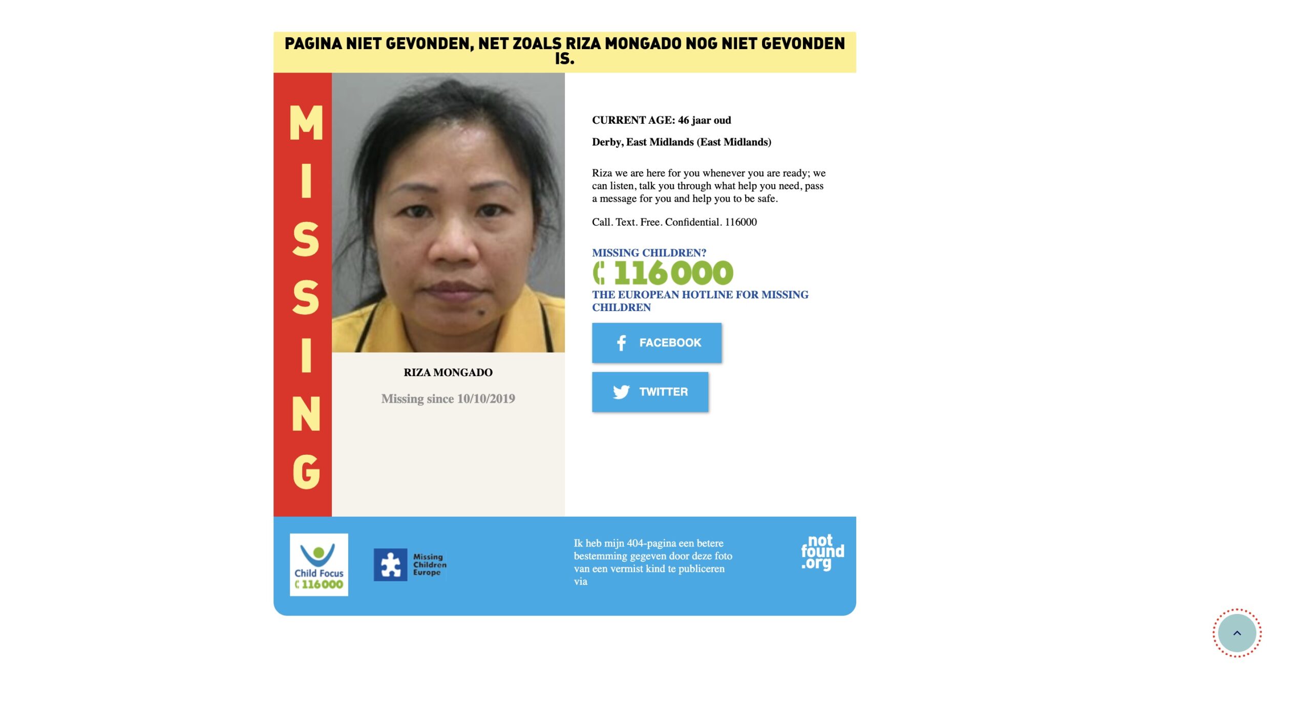
15. NotFound.org – “Turn Your 404 Into Something That Matters”
NotFound.org takes the most frustrating page on your site and gives it meaning. Instead of a dead-end, their 404 solution displays information about real missing children. By installing a simple snippet, site owners can turn a lost click into a powerful public service message—bringing attention to ongoing cases from around the world.
It’s not flashy or funny, and that’s exactly the point. It reminds us that sometimes a small space on your site can carry real weight.
Why it works: It’s purpose-driven, incredibly impactful, and dead simple to implement. A meaningful twist on a forgotten corner of the web—proof that even a 404 can do good.
FAQs About 404 Pages
What is a 404 error?
A 404 error means the page you’re trying to visit doesn’t exist on the server—either because the URL was mistyped, the page was deleted, or it never existed in the first place. It’s the internet’s way of saying, “What you’re looking for isn’t here, sorry!”
What does 404 mean on Showit?
If you’re using Showit and get a 404 error, it typically means a page was renamed, deleted, or the permalink doesn’t match. You can fix it by double-checking your URL settings and making sure your blog is properly connected if you’re using WordPress with Showit.
Why should you put effort into your 404 page?
Because even mistakes are part of the user experience! A well-designed 404 page keeps people on your site, reduces bounce, and shows off your brand’s personality. It’s a small touch that can make a big impression—and maybe even win you a few fans in the process.